

The 8 Secret Ingredients of STUNNING Design
You’ve seen them: designs that just work. They grab your attention, communicate clearly, and just feel… right. But then there are the others. The ones that are cluttered, confusing, or just plain boring.
Ever wonder what separates the masterpieces from the messes? It’s not magic. It’s not even raw talent (though that helps!). It’s understanding a handful of timeless principles that every professional designer uses.
And guess what? You can learn them too!
Forget dry textbooks and confusing jargon. We’re breaking down the 8 core principles of design into simple, actionable insights, each with a crystal-clear visual example. Apply these, and you’ll transform your presentations, social media graphics, websites, and even your doodles into something truly impactful.
The 8 Secret Ingredients of STUNNING Design
Think of these as your superpowers. Once you grasp them, you’ll see the world – and every design – with new eyes.
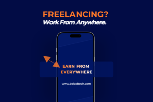
1. Emphasis & Hierarchy: What’s the BIG Idea?
The Secret: Every great design has a star. What’s yours?
This principle is about guiding the viewer’s eye. What do you want them to see first? What’s the most crucial piece of information? Make that element stand out using size, color, or placement. Everything else supports it.
Example:
-
How it Works: The largest text or central object immediately commands your attention. This establishes hierarchy, telling you what to read first, second, and last.
2. Balance: Stability or Drama? You Decide!
The Secret: Give your design a solid foundation.
Balance is about distributing visual “weight.” It ensures no single area of the design feels too heavy or too light.
-
Symmetrical Balance: Think of a mirror image. It feels formal, stable, and calming.
-
Asymmetrical Balance: A large element on one side can be balanced by several smaller, more complex elements on the other. It’s artful and creates movement.
Example:
-
How it Works: Observe how the elements, though possibly different in size and shape, are distributed around the center to feel visually stable and harmonious.
3. Contrast: Make It POP!
The Secret: Differences create interest.
This is all about making elements distinct through color (light vs. dark), size (big vs. small), or texture. Great contrast ensures:
-
Legibility: Text is easy to read against the background.
-
Focus: Key elements immediately grab attention.
Example:
-
How it Works: The stark difference between the black and white (or opposite colors) makes the graphic exciting and ensures the text is instantly readable.
4. Repetition & Rhythm: The Power of Consistency
The Secret: Consistency breeds clarity and professionalism.
This involves reusing the same visual elements (like a specific color palette, font style, or geometric shape) throughout your design.
-
It creates a unified, cohesive look (hello, strong branding!).
-
It establishes a rhythm that guides the viewer’s eye smoothly through your content.
Example:
-
How it Works: The repeated element, whether it’s a specific icon or a color block, creates a predictable pattern and structure, making the entire design feel integrated.
5. Alignment: The Unsung Hero of Clean Design
The Secret: Line everything up! Seriously, everything.
Alignment means arranging elements so their edges or centers line up along invisible lines (often a grid). This instantly transforms a messy design into something polished, professional, and trustworthy.
Example:
-
How it Works: Even in a complex layout, all text and images adhere to a common vertical and horizontal structure (the grid lines), creating order and sophistication.
6. Proportion & Scale: The Goldilocks Zone
The Secret: Size matters, but it’s all relative.
This principle is about the size of elements in relation to each other and to the whole. Are the sizes intentionally chosen to support your hierarchy? A good proportion makes a design feel natural and harmonious.
Example:
-
How it Works: The dramatic difference in scale between the foreground and background elements or between large type and small type is intentional. This relationship directs focus and creates depth.
7. Proximity: Birds of a Feather Flock Together
The Secret: Group related things. Keep unrelated things apart.
When elements are physically close to each other, we assume they’re related. Use this to your advantage to organize information logically and reduce clutter, improving comprehension.
Example:
-
How it Works: Notice how the header text, paragraph, and corresponding button are grouped closely, setting them apart from the next block of information. The space between groups is larger than the space within groups.
8. White Space (Negative Space): Your Design’s Best Friend
The Secret: Space isn’t empty; it’s essential!
This is the space around and between your design elements. It’s often overlooked, but it’s incredibly powerful:
-
Improves Readability: Gives text room to breathe.
-
Creates Focus: Highlights your main content.
-
Adds Sophistication: Makes your design feel clean, modern, and high-end.
Example:
-
How it Works: The ample space around the logo and primary text forces your eye to the center, emphasizing the content and giving the design an airy, elegant feel.
Now that you’re armed with these 8 principles and visual evidence, you’ll never look at a design the same way again. The next time you’re creating something, stop and ask yourself:
-
“What’s the emphasis here?”
-
“Is it balanced?”
-
“Does it have enough contrast?”
-
“Am I using repetition consistently?”
-
“Is everything aligned?”
-
“Are the proportions right?”
-
“Are related items grouped by proximity?”
-
“Does it have enough white space?”
Start applying just one or two of these principles consciously, and watch your designs transform from “meh” to “WOW!”
What’s your favorite design principle to use? Share your thoughts in the comments below!

Tag:Graphic Design


1 Comment